Use only one space between sentences (double spacing is only for those dinosaurs we call typewriters).
Use real quotation marks and apostrophes (Preferences>Use typographers quotes); use proper punctuation with parentheses.

Use special characters (glyphs), en and em dashes (to differentiate from hyphens) where appropriate. Hyphens are used to create compound words: "First-class decisions require clear-headed thinking." or "He has a devil-may-care attitude." Use a dash [ — ] or dashes as a super-comma or set of super-commas to set off parenthetical elements, especially when those elements contain internal forms of punctuation: "All four of them—Bob, Jeffrey, Jason, and Brett—did well in college." [1]
- Hyphen -
- en (n) dash (option + -) –
- em (m) dash (shift + option + -) —
Spend the time to make nice fractions and use correct accent marks (glyphs).


Use bold or italic for emphasis, never underline. Use bolds and italics sparingly.

AVOID THE USE OF ALL CAPS, even in headlines. It looks like you're screaming.
Kern (tighten or decrease tracking) headlines when necessary.
Never, ever use the spacebar to align text! Use Paragraph Alignment.
Regarding the indenting of paragraphs: use a one-em first line indent space on all indented paragraphs; don't indent first paragraphs. Use the Paragraph Panel and Paragraph Styles to define indents.

Leave no widows or orphans (see below).
Avoid more than two hyphenations in a row. Avoid too many hyphenations in any paragraph; check line breaks carefully.

Keep line spacing (leading) consistent.

Either indent the first line of paragraphs or add extra space between them -- but not both.
Never justify text on a short line.
Avoid combining more than three typefaces in a document.
Let your text breathe: embrace white space; don't crowd text inside a box or up against a graphic element.
Use bullets when making a list, not hyphens.

Avoid abbreviations.
Reduce the size of punctuation marks in headlines. Avoid hyphenation in headlines at all costs.
Set the space before an italic word in italic, but not the space after.
Don't be a wimp.
-- Adapted from "The Mac is not a Typewriter," Robin Williams, 2003
Widows and Orphans
"Never leave widows and orphans bereft on the page."
— "The Mac is not a Typewriter," Robin Williams
— "The Mac is not a Typewriter," Robin Williams
In typesetting, widows and orphans are words or short lines at the beginning or end of a paragraph, which are left dangling at the top or bottom of a column, separated from the rest of the paragraph. There is some disagreement about the definitions of widow and orphan; what one source calls a widow the other calls an orphan. The Chicago Manual of Style uses these definitions:
Widow
- A paragraph-ending line that falls at the beginning of the following page/column, thus separated from the remainder of the text. (See below, highlighted text.)
Orphan
- A paragraph-opening line that appears by itself at the bottom of a page/column.
- A word, part of a word, or very short line that appears by itself at the end of a paragraph. Orphans result in too much white space between paragraphs or at the bottom of a page. (See below, the word "lorem" at the end of page 1, paragraph 1.)
Common mnemonics (memory "hooks") are, "An orphan has no past; a widow has no future," and "An orphan is left behind, whereas a widow must go on alone."
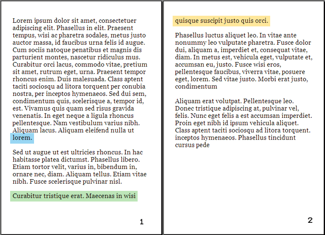 |
(1) At the end of the first paragraph on page 1, the word "lorem" is an orphan in the second sense: a very short final line that, because the rest of its line is white, creates an impression of two lines of whitespace between the paragraphs. (2) Highlighted: A widowed line, the last line of a paragraph all alone on the other side of a page break. |
-- http://en.wikipedia.org/wiki/Widows_and_orphans
Don't confuse readablility with legibility
Legibility is primarily the concern of the typeface designer, to ensure that each individual character or glyph is unambiguous and distinguishable from all other characters in the font. Legibility is also in part the concern of the typographer to select a typeface with appropriate clarity of design for the intended use at the intended size. An example of a well-known design, Brush Script, contains a number of illegible letters since many of the characters can be easily misread especially if seen out of textual context.
Readability is primarily the concern of the typographer or information designer. It is the intended result of the complete process of presentation of textual material in order to communicate meaning as unambiguously as possible. A reader should be assisted in navigating around the information with ease, by optimal inter-letter, inter-word and particularly inter-line spacing, coupled with appropriate line length and position on the page, careful editorial “chunking” and choice of the text architecture of titles, folios, and reference links.
One of the clearest distinctions between the two concepts was presented by Walter Tracy in his Letters of Credit:
[1] grammar.ccc.commnet.edu
Legibility is primarily the concern of the typeface designer, to ensure that each individual character or glyph is unambiguous and distinguishable from all other characters in the font. Legibility is also in part the concern of the typographer to select a typeface with appropriate clarity of design for the intended use at the intended size. An example of a well-known design, Brush Script, contains a number of illegible letters since many of the characters can be easily misread especially if seen out of textual context.
Readability is primarily the concern of the typographer or information designer. It is the intended result of the complete process of presentation of textual material in order to communicate meaning as unambiguously as possible. A reader should be assisted in navigating around the information with ease, by optimal inter-letter, inter-word and particularly inter-line spacing, coupled with appropriate line length and position on the page, careful editorial “chunking” and choice of the text architecture of titles, folios, and reference links.
One of the clearest distinctions between the two concepts was presented by Walter Tracy in his Letters of Credit:
"These … ‘two aspects of a type’ … are … ‘fundamental to its effectiveness. Because the common meaning of 'legible' is 'readable' there are those – even some professionally involved in typography – who think that the term 'legibility' is all that is needed in any discussion on the effectiveness of types. But legibility and readability are separate, though connected aspects of type. Properly understood … the two terms can help to describe the character and function of type more precisely than legibility alone. … In typography we need to draw the definition … of legibility …to mean the quality of being decipherable and recognisable – so that we can say, for example, that the lowercase h in a particular old style italic is not legible in small sizes because its in-turned leg makes it look like the letter b; or a figure 3 in a classified advertisement is too similar to the 8. … In display sizes, legibility ceases to be a serious matter; a character that causes uncertainty at 8 point size is plain enough at 24 point."
Read more at http://en.wikipedia.org/wiki/Typography
[1] grammar.ccc.commnet.edu
No comments:
Post a Comment