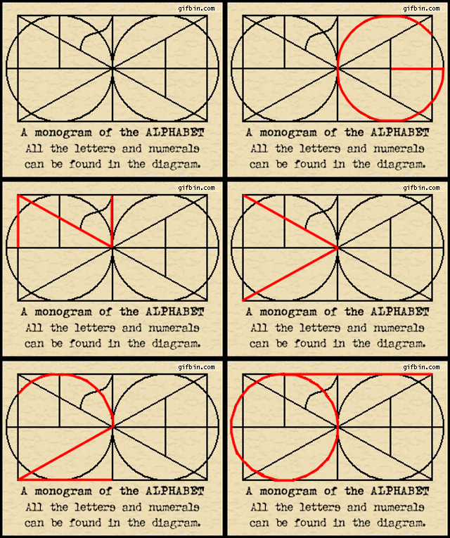
Movable type revolutionized communication: Books could be reproduced by the hundreds instead of by twos and threes. This method of printing didn't change much until the 20th century when computer technology created a second typographic revolution.
Typographic Terms
Much of the vocabulary we use to describe type are artifacts of the early printing process using movable lead or wooden type.
Type - Alphanumeric characters for printing.
Typeface - All type of a single design, such as Helvetica or Times Roman.
Font - An assortment of type of a single size and style, such as 9 point Helvetica Italic. In movable type printing, individual letters were organized in large, flat drawers containing all the characters of a single size and style.
Type measurement - Type is measured in points. Another unit of measurement you see is the pica ( pronouced "PIE kah'). You should know 12 points = 1 pica and 6 picas = 1 inch.
Leading - The space between letters and lines are important too. Leading – pronounced "ledding," as in the element lead – refers to space between lines of text. When printing with movable type, space between lines of words was achieved by inserting thin strips of lead. Each strip was equivalent in thickness to one point. Typically two strips were added, becoming two points of leading. Today, automatic leading adds about 2 points of space between lines (e.g., 8 point type with auto leading is 10 points of leading. This may be expressed "8/10" or "eight over ten").
Tracking - A modern computer-based term referring to space between letters. Older terms include "kerning" and "letterspacing": Kerning is decreasing space between two letters, often so they touch or overlap. (A "kern" is the part of a typeset letter that projects beyond its side bearings, such as the serif of the letter "b." Letterspacing is adding space between letters, the opposite of kerning.
Text Justification = Alignment - Ragged or flush, centered, justified.
Type Classification: Serif and Sans Serif
Serif - Serif type evolved from handwriting. It is supposed that the serifs themselves were imitations of marks made by a brush or pen as the calligrapher created the letter. Serifs are the little ornamentations on the letters themselves. Serif fonts are sometimes considered easier to read than san serif fonts at small sizes (8 point and smaller) or in long blocks of text (body text). Serif fonts can be broadly classified into one of four subgroups: old style, transitional, modern and slab serif:
Old Style or humanist typefaces date back to 1465 and are characterized by a diagonal stress (the thinnest parts of letters are at an angle rather than at the top and bottom), subtle differences between thick and thin lines (low line contrast), and excellent readability. Old style typefaces are reminiscent of the humanist calligraphy [handwriting] from which their forms were derived. An old style font normally has a left-inclining curve axis with weight stress at about 8 and 2 o'clock; serifs are almost always bracketed (they have curves which connect the serif to the stroke); head serifs are often angled. Examples include Adobe Jenson, Arno, Berkeley Old Style, Bembo, Caslon, Galliard, Garamond, Goudy Old Style, Granjon, Janson, Palatino.
The Adobe Garamond typeface, an example of an old-style serif
Transitional or baroque serif typefaces first appeared in the mid-18th century. They are among the most common, including such widespread typefaces as Times New Roman (1932) and Baskerville (1757). They are in between modern and old style, thus the name "transitional." Differences between thick and thin lines are more pronounced than they are in old style, but they are still less dramatic than they are in modern serif fonts. Other transitional serifs include Bookman, Century, Georgia and Plantin.
 |
| The Times New Roman typeface, an example of a transitional serif |
Modern or Didone serif typefaces, which first emerged in the late 18th century, are characterized by extreme contrast between thick and thin lines. Modern typefaces have a vertical stress, long and fine serifs, with minimal brackets. Serifs tend to be very thin and vertical lines are very heavy. Most modern fonts are less readable than transitional or old style serif typefaces. Common examples include Bodoni, Didot, Computer Modern, and Walbaum.
 |
| The Bodoni typeface, an example of a modern serif |
Slab serif or Egyptian typefaces usually have little if any contrast between thick and thin lines. Serifs tend to be as thick as the vertical lines themselves and usually have no bracket. Slab serif fonts have a bold, rectangular appearance and sometimes have fixed widths, meaning that all characters occupy the same amount of horizontal space (as in a typewriter). They are sometimes described as sans-serif fonts with serifs because the underlying character shapes are often similar to sans-serif typefaces, with less variation between thin and thick shapes on the character. Slab serif typefaces date to around 1800.
Examples of slab serif typefaces include Clarendon, Rockwell and Courier.
 |
| The Rockwell typeface, an example of a slab serif |
San Serif - In typography, a sans-serif (sans serif, gothic, san serif or simply sans) typeface is one that does not have the small projecting features called “serifs” at the end of strokes. The term comes from the French word sans, meaning “without”. Sans-serif fonts tend to have less line width variation than serif fonts. Sans serif typefaces were developed in the early 19th century.
Another word for sans serif is "Gothic," not to be confused with blackletter typeface. The term probably derived from the architectural definition, which is neither Greek nor Roman and from the extended adjective term of Germany,which was the place where sans serif typefaces became popular in 19th to 20th century.
Sans-serif designs can be divided into four major groups:
Grotesque or early sans-serif designs. Examples include Grotesque, Akzidenz Grotesk, and Franklin Gothic. The name "Grotesque" came from the Italian word "grottesco," meaning "belonging to the cave." In Germany, the name became Grotesk.
 |
The Franklin Gothic typeface (Grotesque)
|
Neo-grotesque or Transitional or Realist, modern designs such as Standard, Bell Centennial, MS Sans Serif, Helvetica, Univers, Highway Gothic, and Arial. These are the most common sans-serif fonts. They are relatively straight in appearance and have less line width variation than Humanist sans-serif typefaces.
 |
The Helvetica typeface (Neo-grotesque)
|
Humanist These are the most calligraphic of the sans-serif typefaces, with some variation in line width and more legibility than other sans-serif fonts. Antique Olive, Calibri, Johnston, Lucida Grande, Segoe UI, Gill Sans, Myriad, Frutiger, Trebuchet MS, Tahoma, Verdana and Optima are examples.
 |
The Tahoma typeface (Humanist)
|
Geometric As their name suggests, Geometric sans-serif typefaces are based on geometric shapes, like near-perfect circle and square. Note the optically circular letter “O” and the simple construction of the lowercase letter “a”. Geometric sans-serif fonts have a very modern look and feel. Of these four categories, geometric fonts tend to be the least useful for body text. Examples include Futura, ITC Avant Garde, Century Gothic, Gotham, or Spartan.
 |
The Futura typeface (Geometric)
|
Parts of the Letter
Ascender - the part of a letter that is above the body. For example, the tall part of the letter "b."
Descender - the part of a letter that decends below the baseline. For example, the tail of the letter "y."
Body - the main portion of a letter. For example, the round portion of the letter "b." A lower case 'a' only has a body of the letter, no decenders or ascenders. A lower case 'd' has an ascender in addition to its body.
Functions in a Layout
Headline or Display type – Type that introduces the text or grabs the reader's attention. Sizes are generally large, 14 pt or larger.
Subhead - Type smaller and visually less important than a headline, but still commands attention.
Body Type or Text - Type that is subordinate to the headline and makes up the main body of a page. Sizes are in the 6-12 point range. Lengthy text can be made more legible with the addition of a point or two of leading (e.g., 9 point type with 13 points of leading, 12 point type with 16 points of leading).
 |
| The January 13, 1898 edition ofL'Aurore (the "J'accuse" issue): An early example of sans-serif in the media. Select headlines are in a sans-serif typeface. A subheading is at the top of the first column of text. The small type that makes up the majority of the page is the body text. |
Words of Advice
... Two aspects of a type … [are] … fundamental to its effectiveness. Because the common meaning of “legible” is “readable” there are those – even some professionally involved in typography – who think that the term “legibility” is all that is needed in any discussion on the effectiveness of types. But legibility and readability are separate, though connected aspects of type. Properly understood … the two terms can help to describe the character and function of type more precisely than legibility alone. … In typography we need to draw the definition … of legibility …to mean the quality of being decipherable and recognisable – so that we can say, for example, that the lowercase h in a particular old style italic is not legible in small sizes because its in-turned leg makes it look like the letter b; or a figure 3 in a classified advertisement is too similar to the 8. … In display sizes, legibility ceases to be a serious matter; a character that causes uncertainty at 8 point size is plain enough at 24 point.
-- Walter Tracy, Letters of Credit
Neat Stuff
- The Chinese had a printing presses between 1041-1048. The Jikji, a guide for students in the essence of Buddhist practices, was printed in 1377 in Korea (the metal type volume predates the Gutenberg Bible of Germany by 78 years).
- German Johannes Guttenberg printed the Bible in 1440, which is widely accepted as sparking the European Renaissance.
- The area of a layout with type should be proportional to the unprinted area, and the choice of typeface should complement the content.
- Text in all capitals can be difficult to read because there is no variation in the letter forms, no ascenders and descenders.
- Most of the information of a letter is in the top portion. Try it for yourself! Get a newspaper that has headlines in upper and lower case letters and a piece of blank white paper. Cover the bottom half of a headline with the paper and I'll bet you can still read it. But cover the top half of the headline, and you'll probably have some difficulty making out the words.
- The Mac is not a Typewriter, Robin Williams. Second Ed., 2003, Peachpit Press.
- Typography on Wikipedia: Typography, Serif, San Serif
- History of Writing
- History of the Alphabet
- World Heritage Rights Versus National Cultural Property Rights: The Case Of The Jikji
- Printing press
- Gutenberg Press
- Johannes Gutenberg


