Wednesday, December 7, 2016

Parting Shot

This large format sign from a Tokyo train station exemplifies the need for high-resolution raster art. The sign was nearly a billboard -- I forget how tall, but it was about four feet wide -- and used a combination of both raster and vector art.

Click on the image to see a larger version. Right away, you'll recognize the jagginess of a low-resolution raster image and see the superior smoothness of the vectors.

Vector pwns raster in this large format signage. Click to enlarge.

The semester went by much too quickly, but I hope you enjoyed the course as much as I did. Thank you for a great semester. ~HH


Tuesday, November 1, 2016

Download Hi-Res Files from USDA-ARS Website

When you download images from the USDA Agricultural Research Website, be sure you're getting the largest, highest-resolution image you can get by following these steps:

Select your image

Click on "300 dpi Download/Bajar" button in upper right.
(Do not download the preview image here.)

Click on "Download image" at bottom of form.
Filling out the form is not required.

It will take a minute for the image to load in your browser window. Click "OK."

When the image appears in your browser,
right click on it to "Save Image As"
or drag and drop to your desktop.

Monday, October 31, 2016

Visualizing Data with PG&E

PGE.com has an interactive feature that allows you to visualize your energy useage -- both electricity and natural gas -- and plot it against the average temperature and homes that are similar to yours. I wanted to see all data on one graph, so I created my own in Illustrator. 

Click to enlarge.


Wednesday, October 19, 2016

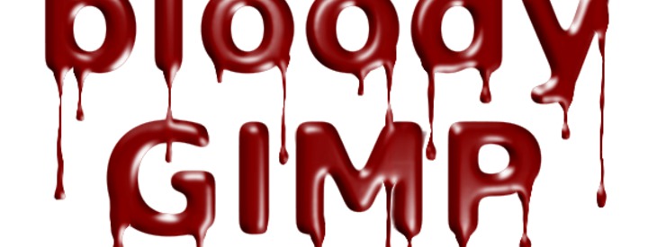
Photoshop Tutorial for Drippy Text


Choose a color and it's drippy paint, bloody or simply melty text. 

Image Editing and Photo Manipulation


Some editing of techniques are considered acceptable, for example enhancement or correction of color or contrast. If someone's hair is out of place on an otherwise good photograph, one might argue that it is acceptable to edit that hair.

We generally understand that advertisements are doctored in order to present idealized beauty and absolute perfection – such as in the Dove Evolution ad or Julia Roberts' in this Lancome ad. Take a close look at those models in ads for beauty products. Could anyone possibly have skin that flawless? Most likely not. The author of Astropix.com puts it beautifully:
"Today's viewers however, are very sophisticated visually. They know full well that anything, literally, can be done to an image. They have seen dinosaurs and aliens portrayed with lifelike realism in the movies. Problems arise though because viewers expect to be fooled in the movies, and tend to get upset and feel betrayed when they are fooled in an allegedly factual medium such as the news business."
Photos composited and manipulated in Photoshop (Wikipedia)


Let's get an introduction to image editing and photo manipulation from Wikipedia: 
Photo manipulation is the application of image editing techniques to photographs in order to create an illusion or deception after the original photographing took place.[1] A mere enhancement or correction is known as retouching.
Types of digital photo manipulation

In digital editing, photographs are usually taken with a digital camera and input directly into a computer. Transparencies, negatives or printed photographs may also be digitized using a scanner, or images may be obtained from stock photography databases. With the advent of computers, graphics tablets, and digital cameras, the term image editing encompasses everything that can be done to a photo, whether in a darkroom or on a computer. Photo manipulation is often much more explicit than subtle alterations to color balance or contrast and may involve overlaying a head onto a different body or changing a sign's text, for examples. Image editing software can be used to apply effects and warp an image until the desired result is achieved. The resulting image may have little or no resemblance to the photo (or photos in the case of compositing) from which it originated. Today, photo manipulation is widely accepted as an art form.
There are several subtypes of digital image-retouching:
Technical retouching Manipulation for photo restoration or enhancement (adjusting colors / contrast / white balance (i.e. gradational retouching), sharpness, noise, removing elements or visible flaws on skin or materials, ...)
Creative retouching Used as an art form or for commercial use to create more sleek and interesting images for advertisements. Creative retouching could be manipulation for fashion, beauty or advertising photography such as pack-shots (which could also be considered inherently technical retouching in regards to package dimensions and wrap-around factors). One of the most prominent disciplines in creative retouching is image compositing. Here, the digital artist uses multiple photos to create a single image. Today, 3D computer graphics are used more and more to add extra elements or even locations and backgrounds. This kind of image composition is widely used when conventional photography would be technically too difficult or impossible to shoot on location or in studio.
Photo manipulation alters the content of the images in a devious manner. It becomes difficult for the audience to differentiate between a manipulated image and reality. But Photoshop's popularity has proven to be divisive. While some laud it for its ability to allow subjects to look their best in a photograph, others see it as a vehicle for feeding our culture's desire for ultimate perfection. Manipulated images are created to deceive the audiences and form their understanding on how the media presents everything with perfection.[11] Therefore, with digital democratization[vague] increasing at a rapid rate it[vague] is creating problems. Since more people have access to technology it[vague] creates curiosity in the readers mind when they see an image published in newspapers or magazines. The reader begins to question the ethics of the publication which results in a debate. Photo images were considered as a reliable source and were known as a medium of communication to present the truth to the media.[2]


Fraudulent Photography, aka "Fauxtography"

This photograph is a dramatic example of deceptive photo manipulation or "fauxtography" — a fraudulent photo designed to deceive its viewers.


In August of 2006, Reuters news agency released this photo which had been altered to appear more sensational than the original. The photographer, Adnan Hajj, had used the clone stamp tool to make a column of smoke appear darker and larger than in the original, unretouched photo. It created an outrage — not only in the media community but also by news consumers around the globe — which resulted in the pulling of all Hajj's photographs from Reuters' services, and the firing of Hajj and his editor. (Read more here.)

Further Reading

See more images and read about the ethics of photo fraud at the links below.

A discussion and results of a readers' poll about wildlife photography and objectivity:
http://www.audubonmagazine.org/articles/nature/nature-photography-objectivity-manipulation-and-ethics?page=show

An in-depth look at the doctoring of news photos, specifically Reuters' Beirut photos:
http://littlegreenfootballs.com/article/21956_Reuters_Doctoring_Photos_from_Beirut

More analysis of Reuter's photo scandals:
http://www.zombietime.com/reuters_photo_fraud/

On the ethics of digital photo manipulation:
http://www.astropix.com/HTML/J_DIGIT/ETHICS.HTM

And finally, a humorous take from TheOnion.com:
http://www.theonion.com/articles/congress-passes-natural-disaster-digitalenhancemen,4252/

Hummingbird Infographic

Infographic: All About Hummingbirds on Nature (PBS.com)

Indentifying Manipulated Photos

Tired of being fooled by manipulated or "Photoshopped" photos? Check out these selections to learn top tips to spot the spoofs:

poynter.org

http://www.poynter.org/latest-news/regret-the-error/173387/three-ways-to-spot-if-an-image-has-been-manipulated/

http://www2.uncp.edu/home/acurtis/Courses/ResourcesForCourses/Photojournalism/PhotoManipulation.html

http://lifehacker.com/5644259/how-to-detect-a-photoshopped-image

http://www.technologyreview.com/news/409754/identifying-manipulated-images/


Wednesday, October 12, 2016

Creating and Maintaining a Portfolio for Employment

A portfolio is a tangible representation of your education and work experience. It is an organized collection of your work which will allow you to demonstrate to a potential employer your strengths, skills and achievements, and an expression of your special qualifications and unique abilities. Use it to show a potential employer why you are the right person for that job or internship.

A portfolio can contain, but is certainly not limited to:
  • Your resume
  • Letters of recommendation or commendation
  • Transcripts
  • Class assignments
  • Photos of projects or displays
  • Outlines of lectures or presentations
  • Photographs of yourself at work
  • Transcripts
  • Certificates of achievement
  • Academic recognition
  • Examples of brochures, handouts, flyers, etc. you've created or helped create
  • Samples of your writing
  • Examples of hobbies or special skills
There are two types of portfolios: traditional and digital. A traditional portfolio is a physical organizer such as a three-ring binder, presentation folder, artist portfolio or zippered case. A digital portfolio can be on a website or a CD. And you don't have to choose between the two, although it might be best to start with the traditional portfolio in order to begin organizing your collection of documents. Then use it as the basis for a digital portfolio (see below).

Create your portfolio by collecting anything that relates to your academic or work experience. Collect everything (yes, everything, then organize it later). Keep your collection of documents current by adding to it as your experience grows. Then when it comes time to organize you'll have a good selection to choose from.

The projects you will create in this class offer you the perfect opportunity to begin assembling an employment portfolio. In this class you will design and create several documents suitable for portfolio pieces. These assignments allow you the opportunity to create portfolio pieces to exhibit your creativity and ability to use Adobe CS software.

Next, organize your portfolio to demonstrate your abilities and achievements. There are many different ways to organize your collection including chronological, topic or subject (such as grant writing skills or photography), and lesson or ability (such as teamwork or communication). Depending on the type of case or binder you choose, organize each item in individual sleeves or pages. Be sure to include a brief, descriptive caption for each item (the exception might be documents such as your resume, letters and transcripts). Use tabbed and labeled dividers to separate sections and keep everything neat and tidy. Add to it as you learn, grow and create new projects; clean out older projects that don't represent your current level of ability or interests.

When the time comes to go to an interview, customize your portfolio for the specific position. Filter out unnecessary documents and include only that which pertains to the particular skills needed for the position. For example, if the job or internship requires public speaking, be sure to include proof of your ability, such as an outline of a presentation you have given or a photo of yourself addressing a group. Limit the size of your portfolio, maybe to 15-20 pages. Also, remember that portfolios are a reflection of the individual. In all my years I've never seen two that are alike and there is certainly no single "correct" way to assemble your portfolio. It will represent your personality and unique abilities.

Finally, you can present your portfolio during your interview. Be sure to inform your potential employer that you have a portfolio of related material that you can bring to your interview and ask what material might be important to bring. Check the University of Wisconsin-River Falls' portfolio website for more excellent tips on how to put together a portfolio and how to present it at an interview.

Digital Portfolios

Digital portfolios are the new normal and include a variety of media including CDs, DVDs and websites. Potential employers can view these in advance of your interview. In the case of online portfolios, employers can search the internet looking for a person with your qualifications and contact you via email through a link on your site. Portfolios that are sent to a potential employer on CD or other portable media are considered "disposable" as they may not necessarily be returned to you.

Digital portfolios are created in much the same way you would your traditional portfolio --- collecting, organizing and customizing --- but instead of compiling everything in a three-ring binder, work is documented electronically (for example, scanned documents, digital photos or PDF files) and compiled so they can viewed on a computer. Many website hosting services make it easy to create your own site even if you don't know anything about building websites (Behance.com, for example). Your digital portfolio can also be in the form of a CD, DVD or Power Point presentation. Keep in mind that the format should be cross-platform (compatible for both PCs and Macs) and industry-standard platform or software (html, PDF or Power Point).

Further resources

Read more about portfolios, what they should contain, and how to organize them:

Electronic portfolio information and hosting:
Example of online portfolios

Food Cartography

A beautiful information graphic. Read the full story at npr.org's blog, The Salt.
 
A detail of a map from Food: An Atlas that shows sources of food
found at farmer's markets in Berkeley, California.
Cameron Reed/Food: An Atlas


Monday, October 10, 2016

Trace Over a Photo to Create Vector Art

Create vector art by using it as a template and trace it in Illustrator.

Open an image in Adobe Illustrator

It can be a bitmap or vector image. We're going to use this bitmap image of a Califoria poppy.


Think of this image in terms of its component shapes, not as the thing itself. Look at each petal, sepal and stem.What colors and shapes do you see?

Begin tracing with the pen tool

Let's begin with the large petal first. Use the pen tool to create a vector shape based on the shape of the petal.

Continue to trace the shapes...


Add fills to your paths

When you're finished tracing, use the Swatches or Color palette to add colors to your illustration.


You can choose to leave or remove the strokes from your illustration. Here I chose to remove the strokes and add gradient fills.


Open both the Color palette and the Gradient palette. Select the object (one of the petals, for example) and apply a gradient fill by clicking on the gradient. Illustrator's default gradient is white to black.


Change the color of the gradient
  • Click on a tab on the gradient ramp, adjust the color in the color palette (you might need to convert a grayscale black to a CMYK or RGB color)
  • Or drag and drop a color to a tab on the gradient ramp


To change the direction of the gradient, choose the Gradient tool, then click and drag across the selected object. Change the blend point by moving the middle slider. Additional color tabs can be added by clicking on the ramp. Adjust color as above.


Vector beauty!

Election Memes = Interesting Infographics

From the New York Times, click to enjoy:


And be sure to vote.

Thursday, October 6, 2016

Wednesday, October 5, 2016

Edward Tufte's Principles for the Analysis and Presentation of Data

  1. Show comparison, contrasts, differences. Compared to what? Evaluate. Make intelligent and appropriate comparisons.
  2. Show causality, mechanism, explanation, systematic structure. Explain why.
  3. Show multivariate data. The only thing that is two dimensional about evidence is the presentation. We live in a multivariate world (3+ dimensions/variables).
  4. Completely integrate words, numbers, images, diagrams. How can something be explained? Integrate the diversity of evidence. Present all relevant evidence regardless of mode.
  5. Documentation. Thoroughly describe the evidence, provide detailed title, authors, sponsors. Document the data sources, show complete measurement scales, point out relevant issues. Transparency equals trust.
  6. Content matters most of all. Analytical presentations ultimately stand or fall depending on the quality, relevance and integrity of their content.

“These summary statements reflect the universal analytic issues of (1) causality, (2) comparison, and (3) multivariate complexity. Human activities, after all, take place in intensely comparative and multivariate contexts filled with causal ideas: intervention, purpose, responsibility, consequence, explanation, intention, action, prevention, diagnosis, strategy, decision, influence, planning.”

— Edward Tufte, Beautiful Evidence

Smashing Magazine's Showcase of Bad Infographics

And why statistical literacy is vital to good information graphic design.

(Source: Physicians Committee for Responsible Medicine in Good Medicine Magazine)
http://www.smashingmagazine.com/2010/05/imagine-a-pie-chart-stomping-on-an-infographic-forever/


Information Graphics

You've seen them. You've used them. But just what are infographics?
"Information graphics — or infographics — are graphic visual representations of information, data or knowledge. These graphics present complex information quickly and clearly, such as in signs, maps, journalism, technical writing, and education."


An infographic combines data visualization and illustration to communicate, inform, persuade or even indulge in a little humor.

Basic types of information graphics

There are two types of infographics: objective and subjective.

Objective graphics present information without bias in such a way that the reader can draw his/her own conclusions. They are intended to educate or even document events. In an objective infographic, all data and points of view are represented equally.


Subjective graphics are often intended to be persuasive and may have an agenda. Information may be edited or left out altogether. This is not necessarily bad -- simply be aware of bias inherent to the graphic.

New America Foundation/Good/DeepLocal

A subset of subjective infographics are considered indulgent, entertaining or amusing, particularly because they communicate no data or information whatever. They present content for the sake of the content alone.


Statistical literacy

Before you embark on creating an information graphic, understand your data completely or risk misinforming your reader.

"Statistical literacy is more than learning the laws of statistics; it is about representations that the human mind can understand and remember. … If you design a visualization before correctly understanding the data on which it is based, you face the very real risk of summarizing incorrectly, producing faulty insights, or otherwise mangling the process of disseminating knowledge. If you do this to your audience, then you have violated an expectation of singular importance for any content creator: their expectation that you actually know what you’re talking about. … 
"Unfortunately, curing statistical illiteracy isn’t as easy as reading an article about it or even taking a statistics course. While a solid understanding of statistics is beneficial for a wide variety of purposes, countering statistical illiteracy requires the cultivation of an active interpretative technique that is separate from knowledge of pure mathematics. 
"Statistical literacy is only the bare minimum, though. The burden on designers is heavier because their uses of data often require them to go beyond interpretation and to perform some basic analysis, summarization or transformation of data. However, a formal education in research methods is probably too extreme. I believe that most mistakes of data could have been avoided had the designers focused on a limited skill set that is to a media producer what statistical literacy is to a media consumer. For now, let’s call this data mindfulness. 
"Mindfulness means exhibiting care, caution, exactness, prudence, regard and many other virtues. Data mindfulness is similar to someone imploring another to “be mindful” of something potentially dangerous. As a designer, you can be careful about the sources of data you choose and can be cautious of the claims you make based on that data. Your exactness is reflected in the effort you put into correctly transforming the original data. Your prudence relates to whether you are honest in your intent and methods. But regard comes closest to the concept of data mindfulness: to be mindful of your data—to avoid mistakes with it and prevent the harm that would result from such mistakes—you should regard it with respect." [1]

The author of the above article, recommends you understand your data, "Mind, Body and Soul," by asking the following of your data:
  • How was it collected? 
  • What are its limitations? 
  • Which mathematical transformations are appropriate? 
  • Which methods of display are appropriate? 
  • Who collected it? 
  • Why was it collected? 
  • What is its context in a broader subject? 
  • What is its context in the field of research that created it?
If you understand your data you'll be equipped to present it in a truthful and understandable context.

Infoporn 

Along with avoiding misleading the reader, avoid creating infoporn: graphics that appear to have organization or hierarchy, but lack meaningful content. These graphics pretend to confer information, but no conclusions can be drawn from the presentation.


What makes a good infographic?

Infographics take on many shapes and forms, from tables and charts to complex illustrations, but any good infographic
  • Will have a meaningful relationship between content and form (presentation)
  • Will suggest or allow high-level conclusions to be drawn from either a user-defined (objective) or persuasive (subjective) presentation
  • Can stand on its own 
  • Cites data source(s) for legitimacy
  • Shows accurate comparisons (see cookie graph above)
  • Is clearly titled, labeled and captioned
Be guided by the Principles for the Analysis and Presentation of Data [2]


  1. Show comparison, contrasts, differences. Compared to what? Evaluate. Make intelligent and appropriate comparisons.
  2. Show causality, mechanism, explanation, systematic structure. Explain why.
  3. Show multivariate data. The only thing that is two dimensional about evidence is the presentation. We live in a multivariate world (3+ dimensions/variables).
  4. Completely integrate words, numbers, images, diagrams. How can something be explained? Integrate the diversity of evidence. Present all relevant evidence regardless of mode.
  5. Documentation. Thoroughly describe the evidence, provide detailed title, authors, sponsors. Document the data sources, show complete measurement scales, point out relevant issues. Transparency equals trust.
  6. Content matters most of all. Analytical presentation ultimately stand or fall depending on the quality, relevance and integrity of their content.

When making an information graphic:
  • Start with good data 
  • Set a clear goal or ask a good question
  • Understand your data
  • Organize the information
  • Ask yourself what it is you want people to understand from reading your graphic. Can the reader obtain high-level information from your graphic?
  • Avoid the look of objectivity if the goal of the graphic is to be persuasive (in other words, be honest)

References and further reading

[1] "Imagine A Pie Chart Stomping On An Infographic Forever" by Eronarn, Smashingmagazine.com, May 10, 2010.  http://www.smashingmagazine.com/2010/05/10/imagine-a-pie-chart-stomping-on-an-infographic-forever/ Includes a a gallery of infographical travesties.

http://en.wikipedia.org/wiki/Information_graphics

http://commons.wikimedia.org/wiki/Category:Information_graphics

Books by Edward R Tufte available in the HSU Library:

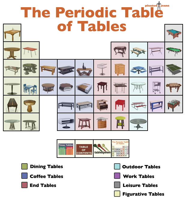
Make a Table in InDesign

http://mashable.com/2011/07/20/spotify-infographic/

A table consists of rows and columns of cells. A cell is like a text frame in which you can add text, inline graphics, or other tables. You can create tables from scratch or by converting them from existing text, or export them from other applications. You can also embed a table within a table.

When you create a table, the new table fills the width of the container text frame. A table is inserted on the same line when the insertion point is at the beginning of the line, or on the next line, when the insertion point is in the middle of a line.

Tables flow with surrounding text just as inline graphics do. For example, a table moves through threaded frames when the text above it changes in point size or when text is added or deleted. However, a table cannot appear on a text-on-path frame.

Below are some important features to get you started. For a video tutorial on creating and formatting tables, see http://www.infiniteskills.com/demos/movie-player.php?h=565&w=970&sku=01710&movie=http://infiniteskills.bc.cdn.bitgravity.com/iskills-media/indesigncs6-demo/1101.mp4  (Ignore the part about following along with demo files.)

Create a table from scratch

The table you create fills the width of the text frame.
  1. Using the Type tool, place the insertion point where you want the table to appear.
  2. Choose Table > Insert Table.
  3. Specify the numbers of rows and columns.
  4. If your table contents will continue on more than one column or frame, specify the number of header or footer rows in which you want the information to be repeated.
  5. (Optional) Specify a table style.
  6. Click OK.
The row height of a table is determined by the specified table style. For example, a table style may use cell styles to format different parts of the table. If any of these cell styles include paragraph styles, the leading value of the paragraph styles determines the row height of that area. If no paragraph style is used, the document’s default slug determines the row height. (The slug is based on the leading value. In this context, a slug is the approximate height of the highlighting in selected text.)

Create a table from existing text

Before you convert text to a table, make sure that you set up the text properly.
  1. To prepare the text for conversion, insert tabs, commas, paragraph returns, or another character to separate columns. Insert tabs, commas, paragraph returns, or another character to separate rows. (In many instances, text can be converted to a table without having to be edited.)
  2. Using the Type tool, select the text you want to convert to a table.
  3. Choose Table > Convert Text To Table.
  4. For both Column Separator and Row Separator, indicate where new rows and columns should begin. Choose Tab, Comma, or Paragraph, or type the character, such as a semicolon (;), in the Column Separator and Row Separator field. (Any character you type appears in the menu the next time you create a table from text.)
  5. If you specify the same separator for columns and rows, indicate the number of columns you want the table to include.
  6. (Optional) Specify a table style to format the table.
  7. Click OK.
If any row has fewer items than the number of columns in a table, empty cells fill out the row.

Selecting Table Cells, Rows and Columns

When you select part or all of the text in a cell, that selection has the same appearance as would text selected outside a table. However, if the selection spans more than one cell, the cells and their contents are both selected.

If a table spans more than one frame, holding the mouse pointer over any header or footer row that is not the first header or footer row causes a lock icon to appear, indicating that you cannot select text or cells in that row. To select cells in a header or footer row, go to the beginning of the table.

Select cells

Using the Type tool, do any of the following:
  • To select a single cell, click inside a table, or select text, and then choose Table > Select > Cell.
  • To select multiple cells, drag across a cell border. Be careful not to drag the column or row line so that you don’t resize the table.
To switch between selecting all of the text in a cell and selecting the cell, press Esc.

Select entire columns or rows

 Using the Type tool, do any of the following:
  • Click inside a table, or select text, and then choose Table > Select > Column or Row.
  • Move the pointer over the top edge of a column or the left edge of a row so that the pointer becomes an arrow shape, and then click to select the entire column or row.

Before and after selecting Row

Select all header, body, or footer rows

  1. Click inside a table, or select text.
  2. Choose Table > Select > Header Rows, Body Rows, or Footer Rows.

Select the entire table

Using the Type tool, do any of the following:
  • Click inside a table, or select text, and then choose Table > Select > Table.
  • Move the pointer over the upper left corner of the table so that the pointer becomes an arrow shape, and then click to select the entire table.

    Before and after selecting table
  • Drag the Type tool across the entire table.
You can also select a table in the same way you select an anchored graphic—place the insertion point immediately before or after a table, and then hold down Shift while pressing the Right Arrow key or Left Arrow key, respectively, to select the table. 

Formatting Tables

Use the Control panel or Character panel to format text within a table—just like formatting text outside a table. In addition, two main dialog boxes help you format the table itself: Table Options and Cell Options. Use these dialog boxes to change the number of rows and columns, to change the appearance of the table border and fill, to determine the spacing above and below the table, to edit header and footer rows, and to add other table formatting.

Use the Table panel, the Control panel, or the context menu to format the table structure. Select one or more cells and then right-click (Windows) or Control-click (Mac OS) to display a context menu with table options.

Monday, October 3, 2016

Adobe Bridge


Adobe® Bridge, provided with Adobe Creative Cloud, or Adobe Creative Suite® 6 and CS5 components, lets you organize the assets you use to create content for print, web, and video. Adobe Bridge keeps native Adobe files (such as PSD and PDF) as well as non‑Adobe files available for easy access. You can drag assets into your layouts, projects, and compositions as needed, preview files, and even add metadata (file information), making the files easier to locate.


Adobe Bridge is a great file management program which you might find helpful if you have a large number of photos to organize. In addition to organization, you can label, prioritize, batch process and share files. Of particular interest is Bridge's integration with some of Photoshop's automated features (Contact Sheet and Photomerge) and photo adjustment with Camera Raw.

File browsing
From Adobe Bridge you can view, search, sort, filter, manage, and process image, page layout, PDF, and dynamic media files. You can use Adobe Bridge to rename, move, and delete files; edit metadata; rotate images; and run batch commands. You can also view files and data imported from your digital still or video camera. See View and manage files.


Mini Bridge
Browse and manage assets using the Mini Bridge panel in Adobe Photoshop®, Adobe InDesign®, and Adobe InCopy®. Mini Bridge communicates with Adobe Bridge to create thumbnails and keep files up-to-date. Mini Bridge lets you work with files more easily within the host application. See Mini Bridge and watch the short video introduction.


Camera raw
If you have Adobe Photoshop, Adobe Lightroom, or Adobe Creative Suite installed, you can open camera raw files from Adobe Bridge and save them. You can edit the images directly in the Camera Raw dialog box without starting Photoshop or Lightroom, and copy settings from one image to another. If you don’t have Photoshop installed, you can still preview the camera raw files in Adobe Bridge. See Work with Camera Raw.

Color management
You can use Adobe Bridge to synchronize color settings across color-managed Adobe Creative Suite components. This synchronization ensures that colors look the same in all Adobe Creative Suite components. See Manage color.

Friday, September 30, 2016

Wednesday, September 28, 2016

Color Me Happy

Light, as some of you science folks probably already know, is a pretty tricky thing. It is often described as waves or particles or radiation or energy. We see it reflected off the surfaces of objects or projected from computer monitors. Light is received by our optic nerves and transmitted to the brain which interprets it. Different wavelengths of visible light are interpreted as different colors. While physics or physiology are important, in this class we're mostly concerned with how we interpret and use color in our layouts and designs.

Thevisible spectrum (above) can be visualized as a rainbow: red, orange, yellow, green, blue, violet. NASA image, Wikimedia Commons
We see color that is reflected from an object. If all colors of the visible spectrum are reflected, we perceive the object as white (all the colors of the spectrum combine to make white light). If only the red light waves are reflected, we perceive the object to be red. If little or no light is reflected, we perceive the object to be black. Reflected light is described as subtractive (if you mix colors together, color gets absorbed, subtracted or taken away.) Remember mixing all your finger paints to make that yukky brown? That's subtractive.


Subtractive Color Model (RYB)


Stated above, but we'll repeat here for emphasis: We see color that is reflected from an object. If all colors of the visible spectrum are reflected, we perceive the object as white (all the colors of the spectrum combine to make white light). If only the red light waves are reflected, we perceive the object to be red. If little or no light is reflected, we perceive the object to be black. Reflected light is described as subtractive (if you mix colors together, color gets absorbed, subtracted or taken away.) Remember mixing all your finger paints to make that yukky brown? That's subtractive.


The Visible Spectrum and a simple RYB (Red-Yellow-Blue) Color Wheel

Another RYB Color Wheel,
"Primary, secondary, and tertiary colors of the RYB color model—Wikipedia
 See more color wheels here.


Color Relationships (RYB)


Primary colors are red, blue and yellow. Think of them as prime numbers. They are as simple as it gets. The secondary colors are a mixture of two primary colors: red + blue = violet. Equal mixtures of primaries (or secondaries) makes a neutral(ish) gray.


RYB Color Model -- Primaries, Secondaries and Neutral

Now refer back to the color wheel. Colors opposite each other on the color wheel are considered to be complementary*. They have nothing in common. For instance red is complementary to green, green is made of the primary colors blue and yellow which have nothing in common with red. Complementary colors seem to vibrate when placed next to each other and have an energizing and sometimes shocking effect on a color scheme.

Colors near each other (adjacent) on the color wheel are called analogous. They are harmonious color combinations because they are similar or have something in common. For example, violet, blue and green are analogous because they have blue in common.

Another way to think of color is in terms of temperature. Warm colors are red, orange and yellow. Cool colors are green, blue and violet.

Another word for color is hue. If a color is fully saturated, it is at its most intense. If it is desaturated, it is less intense. "Baby blue" is less saturated than "cobalt blue."

tint is a color that is a color that has been lightened, as if it had white added to it. Pink is a tint of red. A shade is a color that is darkened. "Navy blue" is a shade of blue.

White and black are neutrals. White reflects all the wavelengths of light, and black absorbs all. Grays can be neutral if composed of equal amounts of color. Sometimes grays can lean toward a color, and be considered warm or cool accordingly (blue-gray, for example.)

Here is Photoshop's color picker with examples of saturated and desaturated colors, tints, shades and neutrals:

Photoshop's Color Picker

Wikipedia explains this better than I can:
In colorimetry and color theorycolorfulnesschroma, and saturation are related but distinct concepts referring to the perceived intensity of a specific colorColorfulness is the difference between a color against gray. Chroma is the difference of a color against the brightness of another color which appears white under similar viewing conditions. Saturation is the difference of a color against its own brightness. …

A highly colorful stimulus is vivid and intense, while a less colorful stimulus appears more muted, closer to gray. With no colorfulness at all, a color is a “neutral” gray (an image with no colorfulness in any of its colors is called grayscale). With three attributes—colorfulness (or chroma or saturation), lightness (or brightness), and hue—any color can be described.

Saturation is one of three coordinates in the HSL and HSV color spaces. Note that virtually all computer software implementing these spaces use a very rough approximation to calculate the value they call "saturation," such as the formula described for HSV and this value has little, if anything, to do with the description shown here.
The saturation of a color is determined by a combination of light intensity and how much it is distributed across the spectrum of different wavelengths. The purest color is achieved by using just one wavelength at a high intensity, such as in laser light. If the intensity drops, so does the saturation. To desaturate a color in a subtractive system (such as watercolor), you can add whiteblackgray, or the hue's complement.


Colors also have cultural, social and emotional baggage. There was a time when you would seldom see anything but red, white and blue used in political advertising because of the patriotic sentiment that the designers are trying to evoke. Likewise, blue is an unappetizing color so it might be used judiciously in food packaging. On the other hand, reds, yellow, browns and greens — colors which we readily associate with edible items — are frequently employed in food advertising and packaging. Think about that the next time you have a blue M&M or sports drink.

Colors are subject to trends, too. Every so often fashionistas elevate certain colors while others fall out of favor. I wouldn't expect to see a trendy new house appointed with avocado green carpet and harvest gold appliances like those of my 1970s childhood.


Additive Color Model (RGB)

Many of us -- artists, painters, commercial printers, designers of printed products, and so forth -- work with the subtractive (RYB) color model described above. As users of computers and mobile devices, we need to grasp RGB representation (in the additive color model) and learn to understand its relationship to RYB. 
If we project colored light, we will discover that it behaves differently than reflected light (paint, for instance). In this case, the prime units of color are red, green and blue. Your TV screen and computer monitor use this scheme to represent colors and thus pictures. Grab a magnifying glass and put it up to the monitor and you'll see. (Really! It's cool!) 

This model of representing color is known as RGB.
RGB Color Model -- Primaries, Secondaries and Neutral
When red, green and blue light (RGB) is mixed equally at full intensity it creates white light. This is known as additive color. By adding the red, green and blue light together you create white light, the full visible spectrum. On the other hand, if you take light away, it becomes black --- the absence of light.

Notice that the combinations of red, blue and green don't make the same colors as you might expect them to based on the subtractive (RYB) color wheel. Red and green light mixes to make yellow light.


Printing Color Images (RYB)


Full color images are printed by what's known as four color process (or process color). Generally, just four colors of ink are used to approximate the colors we see in the visible spectrum: Cyan (blue), Magenta (red), Yellow and Black or CMYK (K = "key" or black). There are special instances where additional colors can be added during printing.

A full color image, such as the one at right is separated into the four colors below for process printing. These separations are made into negatives which in turn are used to make printing plates. Each of the plates is used to print its corresponding color, and the colors are registered or aligned so that the colors match up and create the "full color" image we see on the page.

CMYK Composite image

Below is a representation of each separation of the full color picture above. As each ink is printed on the page, the colors combine to create the full color image. Think back to the color wheel and the primary colors... blue...red...yellow.... Since there is a lot of green in the foliage, it's natural to see lots of yellow and blue in that area. But what you might find enlightening is the amount of magenta and black there too. These colors help make shadows and highlights and give depth and richness to the color of the foliage.


CMYK Separations: Cyan, Magenta, Yellow, Black

Process printing inks are semi-transparent which means that they allow some of the other inks to show through. Inks are also printed as halftones (see below), so that some of the paper will show through too.

And even though we talk about the color building up, keep in mind that it's really "subtracting" light. Dark colors (created by densely printed inks) absorb more light rays than they reflect and thus subtract light that your eyes would otherwise see.


How process color builds up to appear to be "full color"


Halftones**


Halftone screens consist of dots that control how much ink is deposited at a specific location. Varying their size and density creates the illusion of variations of gray or continuous color. For a process color image (four color or full color), four halftone screens are used: cyan, magenta, yellow, and black-one for each ink used in the printing process.

Three examples of color halftoning with CMYK separations.
From left to right: The cyan separation, the magenta separation, the yellow separation, the black separation, the combined halftone pattern and finally how the human eye would observe the combined halftone pattern from a sufficient distance. (Wikipedia)

In traditional print production, a halftone is produced by placing a halftone screen between a piece of film and the image and then exposing the film. Digital halftoning uses a raster image or bitmap within which each pixel which may be on or off, ink or no ink.

Get out that magnifying glass again and take a close look at newspaper and magazine photos to see the tiny dots which create the "photo." Note also how high quality glossy magazines use a finer screen (dots) and newspapers use a coarse screen. This is because of the type of paper, printing processes and machinery unique to each medium.

Grayscale image, halftone screen with black ink.
Light areas have smaller dots, dark areas have larger dots.
CMYK color image, halftone screens with process ink
at different screen angles; correctly registered dots form rosettes.

Spot Color (Pantone or PMS Colors)


Sometimes you might want to just use a single color of ink, or perhaps black plus one color called a spot color. You'll be specifying a Pantone or PMS (Print Matching System) color. Printers have books of color swatches from which to select these colors. These colors come either ready-mixed or are custom-mixed by the printer. 

Pantone colors libraries are available in InDesign, Illustrator and Photoshop. These libraries, as well as specific CMYK colors, allow designers and printers to speak the same language because what is baby blue to you might be a horse of a different color to your printer.

Models vs Modes of Color


Until now we've been discussing color models. Models are methods of defining color, whereas modes are particular to Photoshop, specifically, how the application defines color. Here is a list of Photoshop's modes:
  • Bitmap
  • Grayscale
  • Duotone
  • Indexed Color
  • RGB Color
  • CMYK Color
  • Lab Color
  • Multichannel
In the case of RGB and CMYK, the color models share the same name as the color modes. In all other cases, the modes are specific to Photoshop. In our work, we will concern ourselves with only these modes:
  • Bitmap - uses only two colors, black and white, to represent images. (Note: This is not the bitmap file format ".bmp" you might see generated from some PC applications.)
  • Grayscale - uses 256 shades of gray.
  • RGB - based on the primary colors of red, green and blue. This is how your monitor displays colors and how scanners scan images. After a picture is scanned, it needs to be converted to CMYK for printing.
  • CMYK - based on the Cyan, Magenta, Yellow and Black process printing model. This is the color mode used for printing color images.
InDesign and Illustrator create images in either RGB or CMYK modes.

Color gamuts (Photoshop)‡


A gamut is the range of colors that a color system can display or print. 
The term gamut was adopted from the field of music, where it means the set of pitches of which musical melodies are composed ….
In color theory, the gamut of a device or process is that portion of the color space that can be represented, or reproduced. Generally, the color gamut is specified in the hue–saturation plane, as a system can usually produce colors over a wide intensity range within its color gamut; for a subtractive color system (such as used in printing), the range of intensity available in the system is for the most part meaningless without considering system-specific properties (such as the illumination of the ink).
When certain colors cannot be expressed within a particular color model, those colors are said to be out of gamut. For example, while pure red can be expressed in the RGB color space, it cannot be expressed in the CMYK color space; pure red is out of gamut in the CMYK color space.
A device that is able to reproduce the entire visible color space is an unrealized goal within the engineering of color displays and printing processes. While modern techniques allow increasingly good approximations, the complexity of these systems often makes them impractical.
While processing a digital image, the most convenient color model used is the RGB model. Printing the image requires transforming the image from the original RGB color space to the printer's CMYK color space. During this process, the colors from the RGB which are out of gamut must be somehow converted to approximate values within the CMYK space gamut. Simply trimming only the colors which are out of gamut to the closest colors in the destination space would burn the image. There are several algorithms approximating this transformation, but none of them can be truly perfect, since those colors are simply out of the target device's capabilities. This is why identifying the colors in an image which are out of gamut in the target color space as soon as possible during processing is critical for the quality of the final product.


The visible spectrum of colors (those able to be seen by the human eye) is wider than the gamut available in any color model:


Color gamuts: A. Lab color gamut
B. RGB color gamut C. CMYK color gamut

Among the color models used in Photoshop, Lab has the largest gamut, encompassing all colors in the RGB and CMYK gamuts. Typically, RGB gamuts contain the subset of these colors that can be viewed on a computer or television monitor (which emits red, green, and blue light). Therefore, some colors, such as pure cyan or pure yellow, can't be displayed accurately on a monitor.  

CMYK gamuts are smaller, consisting only of colors that can be printed using process-color inks. When colors that cannot be printed are displayed on-screen, they are referred to as out-of-gamut colors — that is, outside of the CMYK gamut. (See Identifying out-of-gamut colors, Photoshop.)

A comparison of RGB and CMYK color spaces. The image demonstrates the difference between the RGB and CMYK color gamuts. The CMYK color gamut is much smaller than the RGB color gamut, thus the CMYK colors look muted. If you were to print the image on a CMYK device (an offset press or maybe even a ink jet printer) the two sides would likely look much more similar, since the combination of cyan, yellow, magenta and black cannot reproduce the range (gamut) of color that a computer monitor displays. This is a constant issue for those who work in print production. Clients produce bright and colorful images on their computers and are disappointed to see them look muted in print. (An exception is photo processing. In photo processing, like snapshots or 8x10 glossies, most of the RGB gamut is reproduced.)
— http://en.wikipedia.org

:: :: ::

*com·ple·men·ta·ry
Pronunciation: "käm-pl&-'men-t(&-)rE
Function: adjective
1 : relating to or constituting one of a pair of contrasting colors that produce a neutral color when combined in suitable proportions
2 : serving to fill out or complete
3 : mutually supplying each other's lack
4 : being complements of each other
5 : characterized by the capacity for precise pairing of purine and pyrimidine bases between strands of DNA and sometimes RNA such that the structure of one strand determines the other
- com·ple·men·ta·ri·ly /-'men-t(&-)r&-lE, -(")men-'ter-&-lE/ adverb
- com·ple·men·ta·ri·ness /-'men-t(&-)rE-n&s/ noun
- complementary noun

com·pli·men·ta·ry
Pronunciation: "käm-pl&-'men-t(&-)rE
Function: adjective
1 a : expressing or containing a compliment b : FAVORABLE
2 : given free as a courtesy or favor
- com·pli·men·ta·ri·ly /-'men-t(&-)r&-lE, -(")men-'ter-&-lE/ adverb

source: http://m-w.com


** Adapted from Adobe Photoshop Help.

Gamut adapted from Adobe Photoshop 7.0 Help


More about Color on Wikipedia (try to not get lost)
What would you say about the color scheme of this logo?
What relationships do these colors have to each other?
Cool? Warm? Complementary? Analogous?